Dreisiebner

The redefinition of the brand required a comprehensive renovation of the brand architecture with the aim of simplifying and standardising the product portfolio.

The idea for the labels is therefore based on the graphic element of the postcard, conveying impressions and feelings when looking at the heart road in the middle of the vineyards.

The front part is dedicated to a romantic photo of a road among vineyards. The last part consists of the basic information and the message that the postcard conveys.

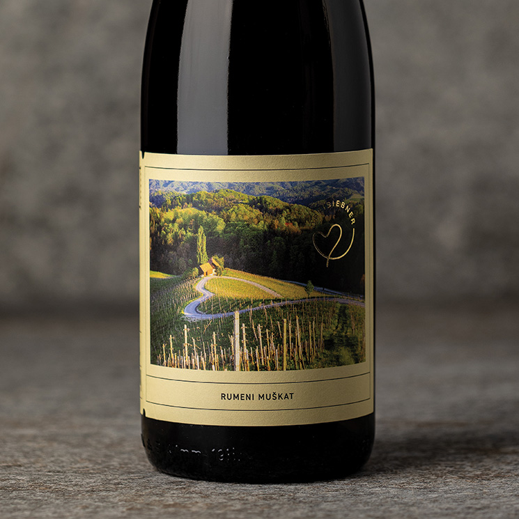
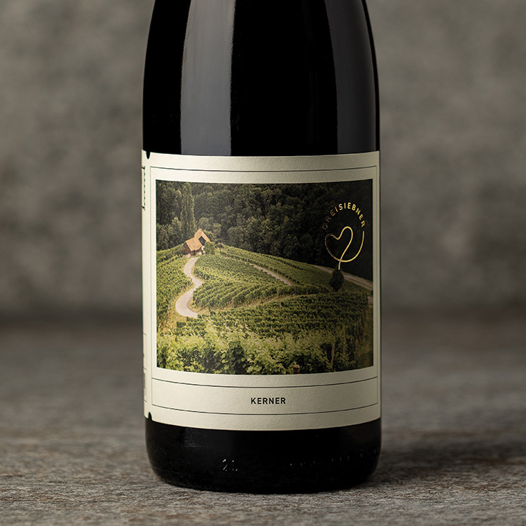
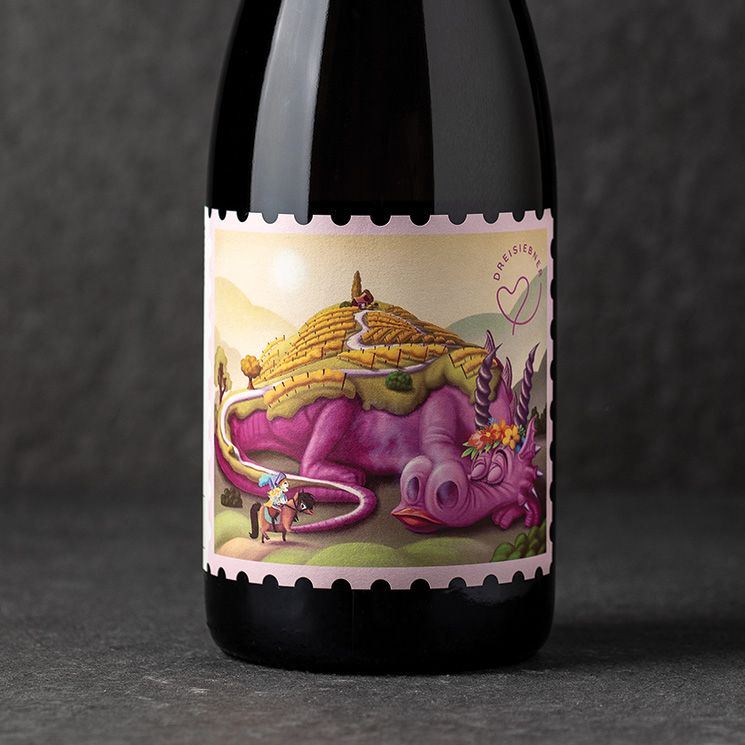
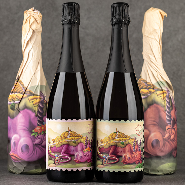
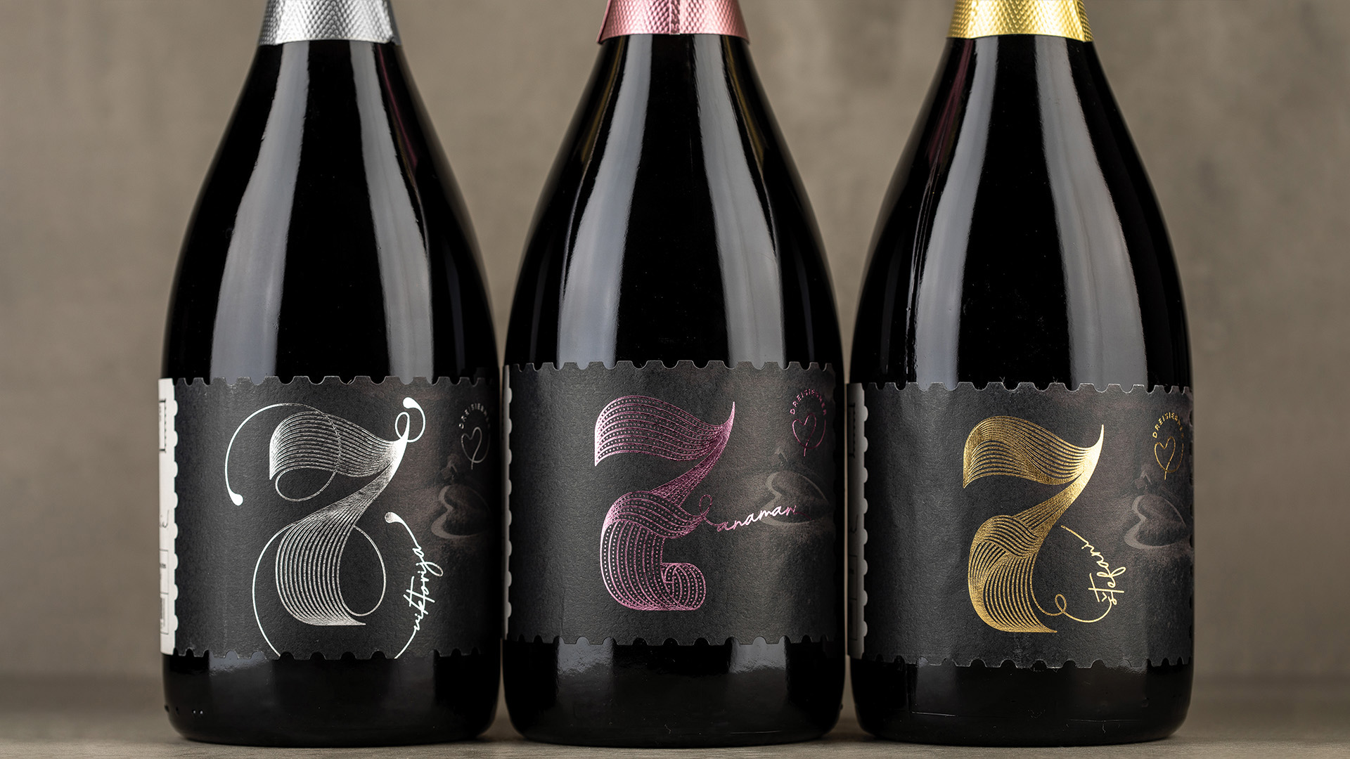
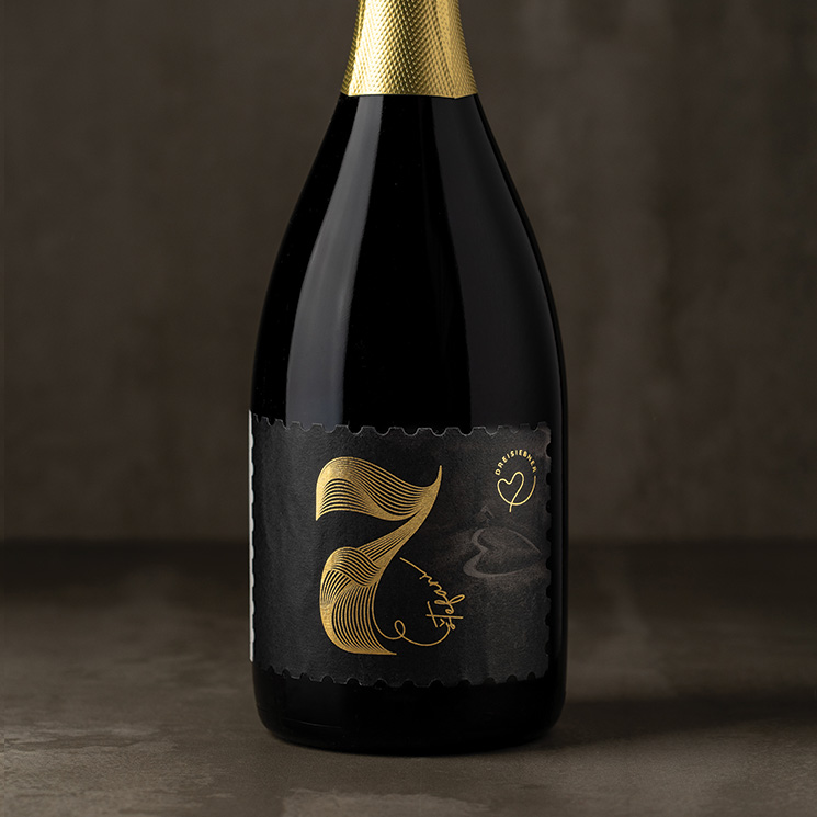
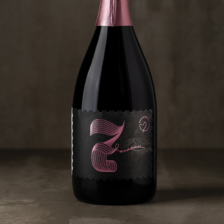
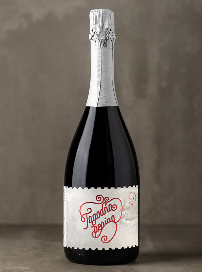
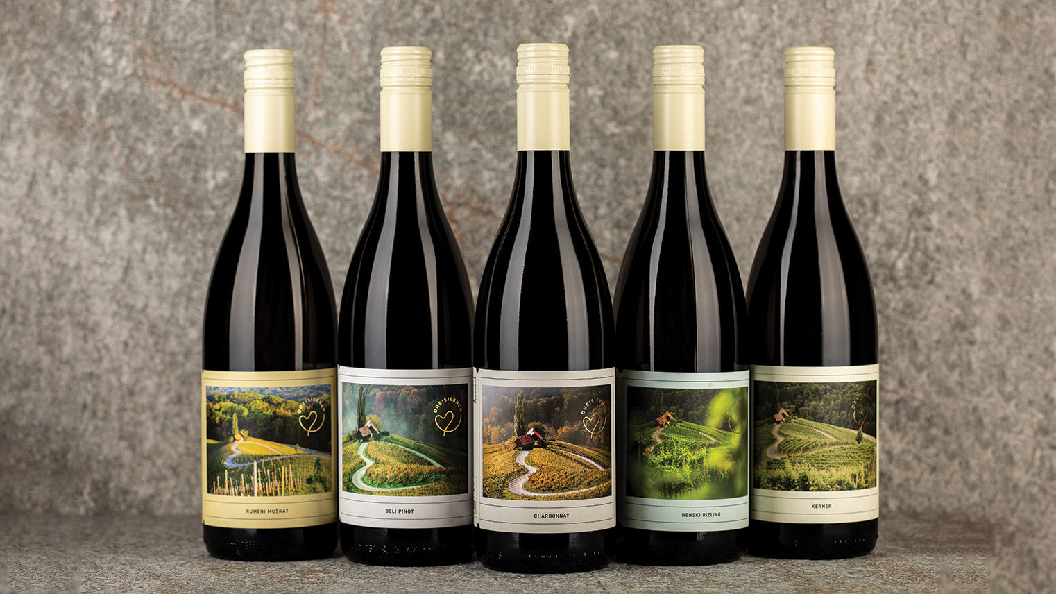
The idea for the labels is based on the visual form of a postcard and sending impressions and feelings when looking at the "heart road among the vineyards". The front part is dedicated to a romantic photo of the road, while the back part is dedicated to basic information and the message that the postcard brings.

The path that winds between the vineyards of Špičnik when viewed from under the statue of St. George on a horse, looks like a Heart among the vineyards! It is also the most beautiful image, which describes the place, the family and the love for the wine.

Statue of St. George stands on the estate of the Dreisiebner family. The illustration represents the story of Saint George, who protects the place from the sleeping dragon. We made two versions for girls and boys.

On the basis of an integrated identity, we have consequently developed 3 modern wine labels based on the design idea platform of a letter stamp. In the background, we placed a black and white image of the supporting motif of the wine road "heart among vineyards" and added to it an elegantly designed number seven, from which the name of a family member is derived. Sparkling wines are thus visually distinguished by color and derived name. But when they stand together they symbolically illustrate the family surname Drei (drei -3) Siebner (sieben-7).