Vinag 1847


The redefinition of brand development was based on the revitalisation of the brand and the creation of a new image.

The client approached us with the task of developing an elegant and simplified identity system, the purpose of which is to provide a high degree of flexibility for communication through multiple marketing channels. We highlighted the year 1847, when the story of one of the largest tunnel cellar in this part of Europe began to be written - Vinag wine cellar, the city under the city.

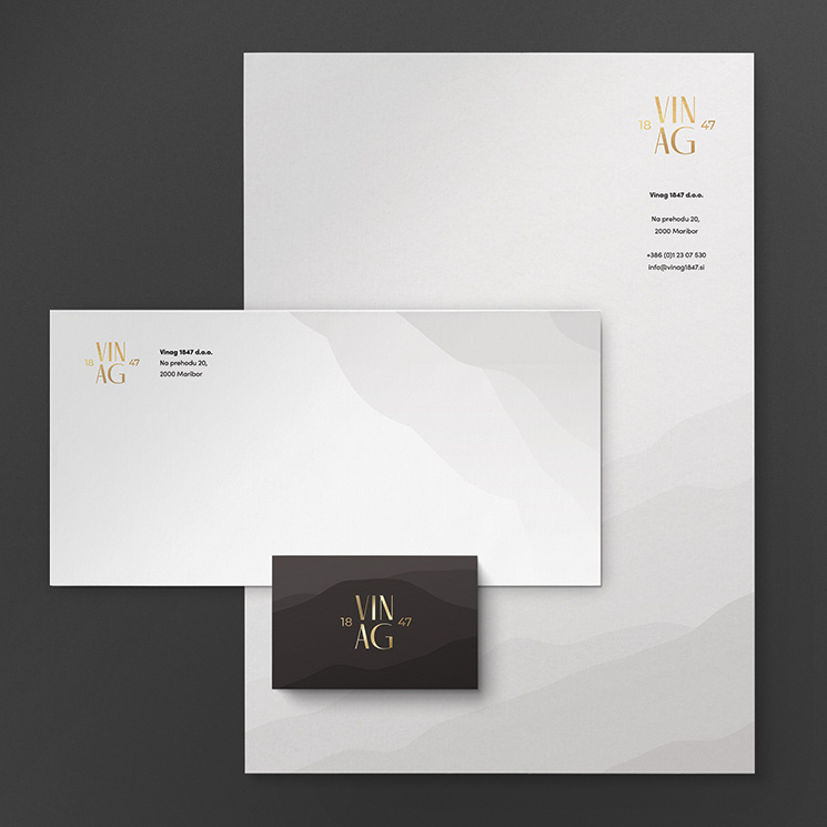
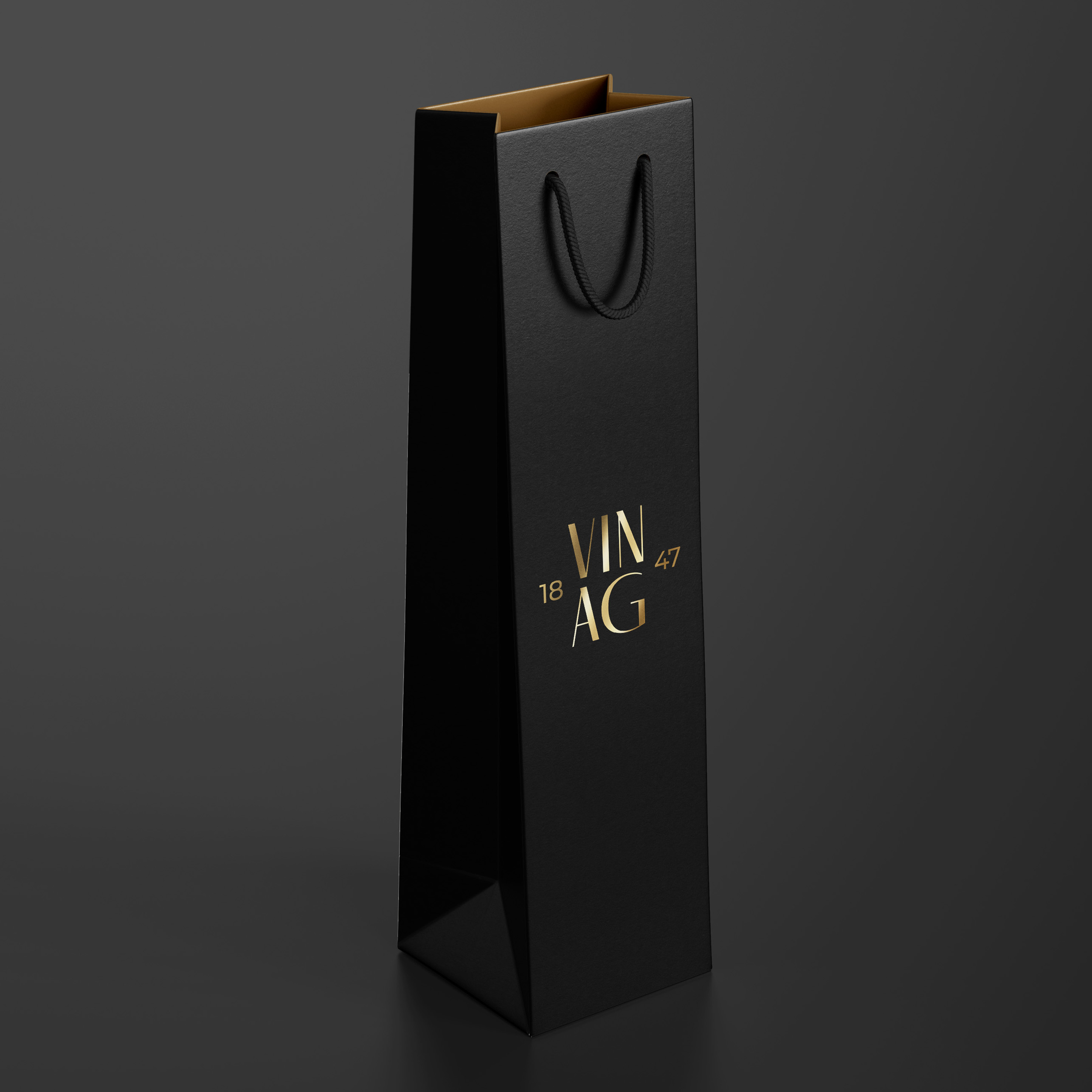
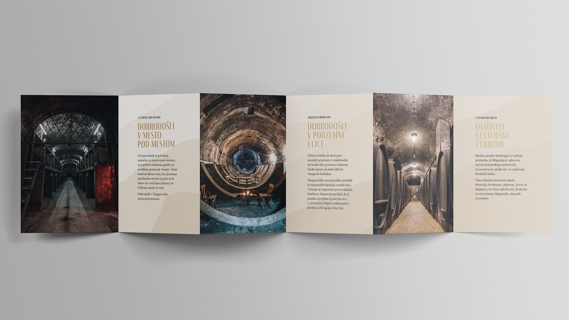
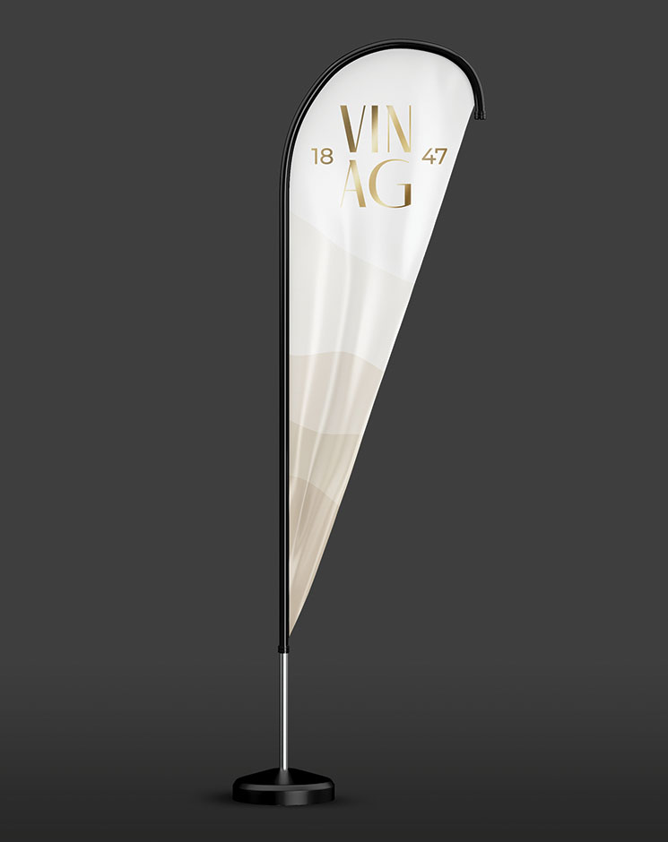
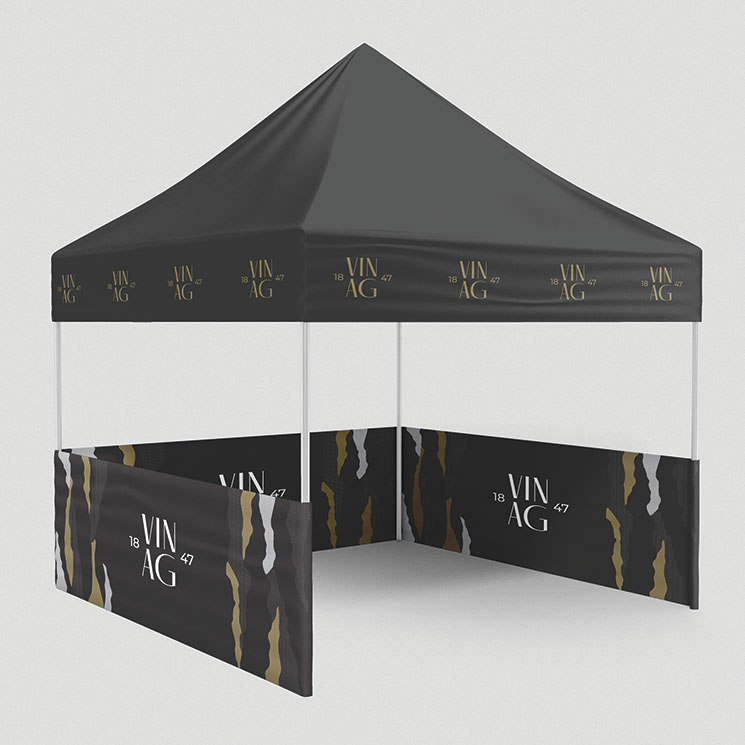
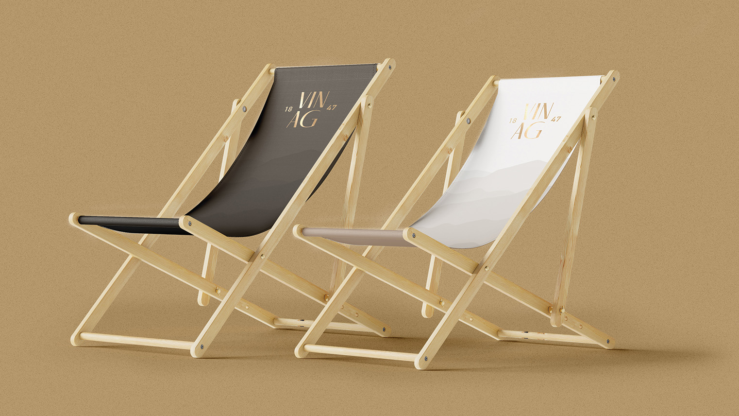
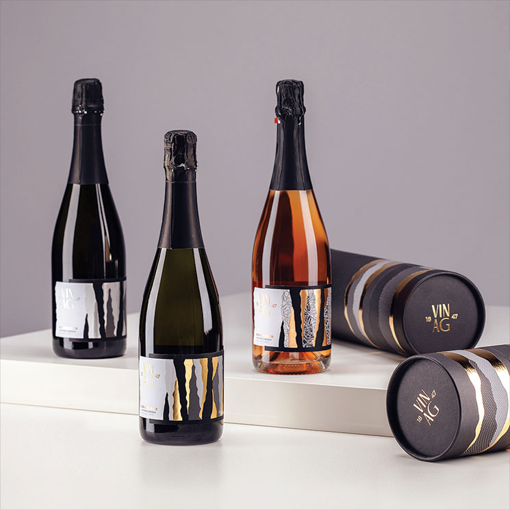
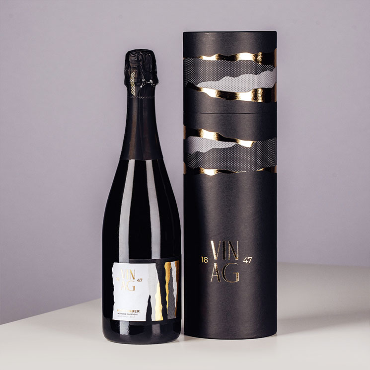
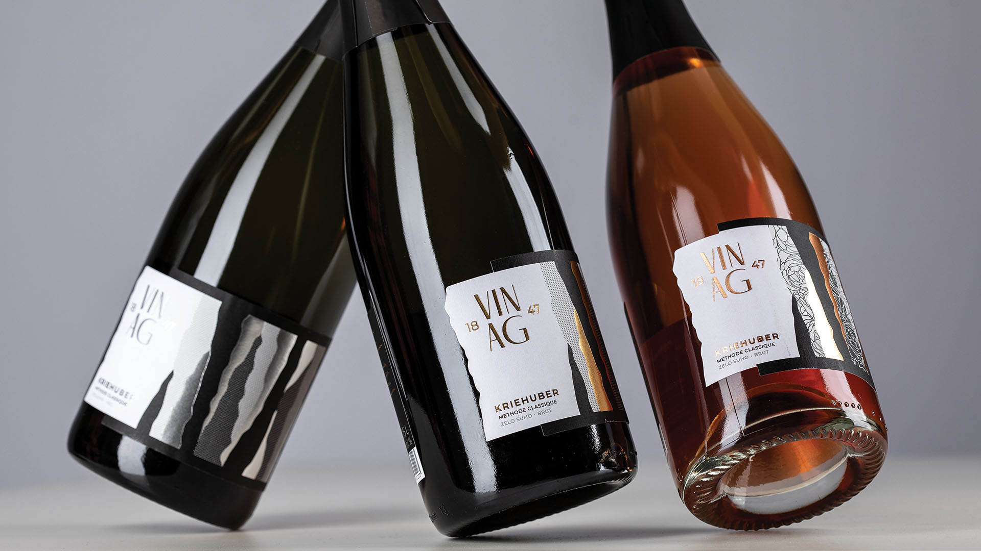
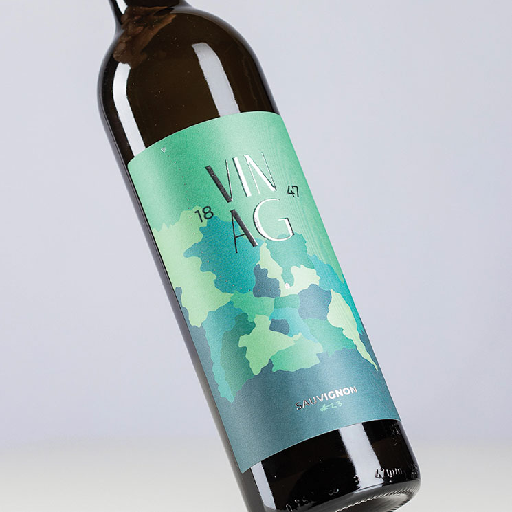
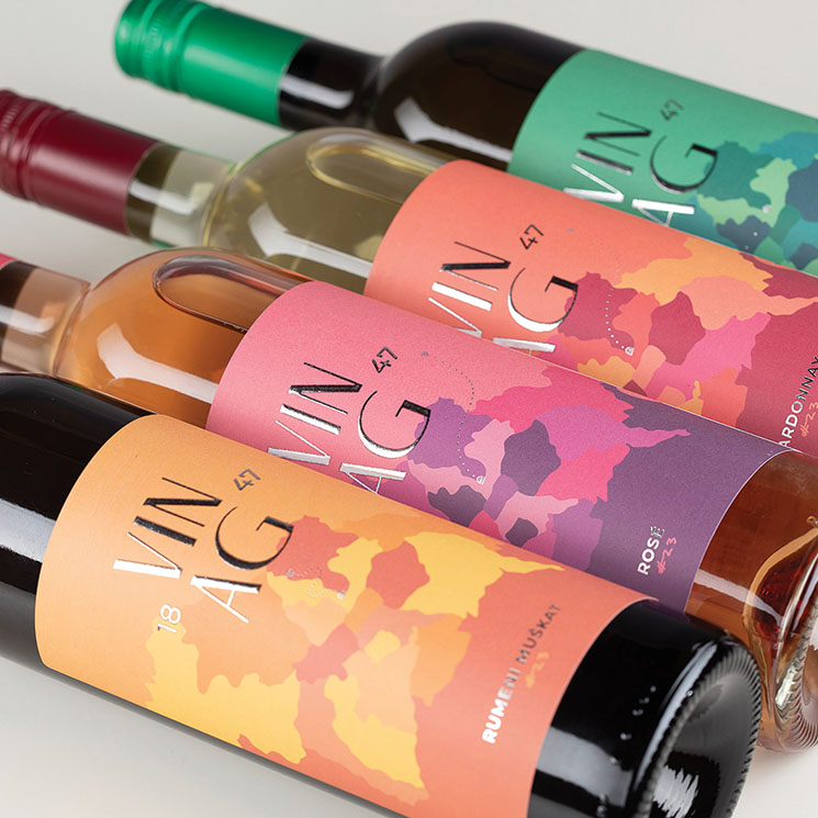
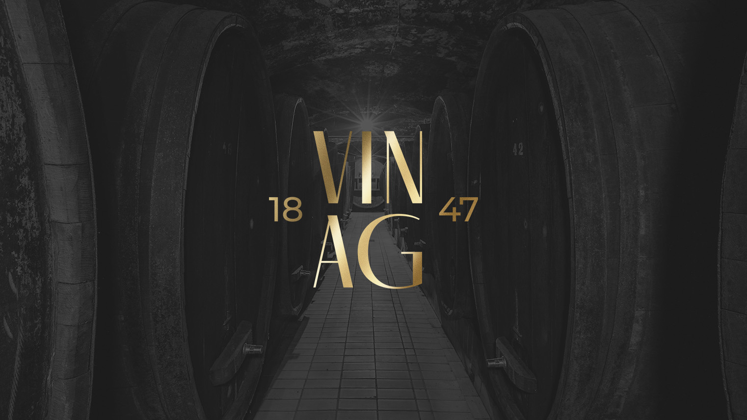
The key visual comes from the magical number 23, which on a symbolic level communicates 23 steps below where Vinag's wine cellar is located. The design concept derives from the continuation of the integrated identity, where we introduced graphic elements through 23 layers.

We created an integrated elegant identity that connects their brand and marketing products such as product catalogues and brochures, technical sheets, leaflets, advertisements, labels, , promotional material and gift program.

The design concept of the labels for sparkling wine and gift boxes comes from the continuation of the overall identity, where we introduced graphic elements through 23 layers, patterns and shapes.

When designing the wine labels for still wine, we drew inspiration from the topographical map of the city quarter, where we showed the route from the vineyard to the wine cellar in the centre of the city in a subtle and simple way. In addition to the story, the attractive visual identity also supports the business aspiration of the subscriber for visibility and notice-ability. We named her #23.