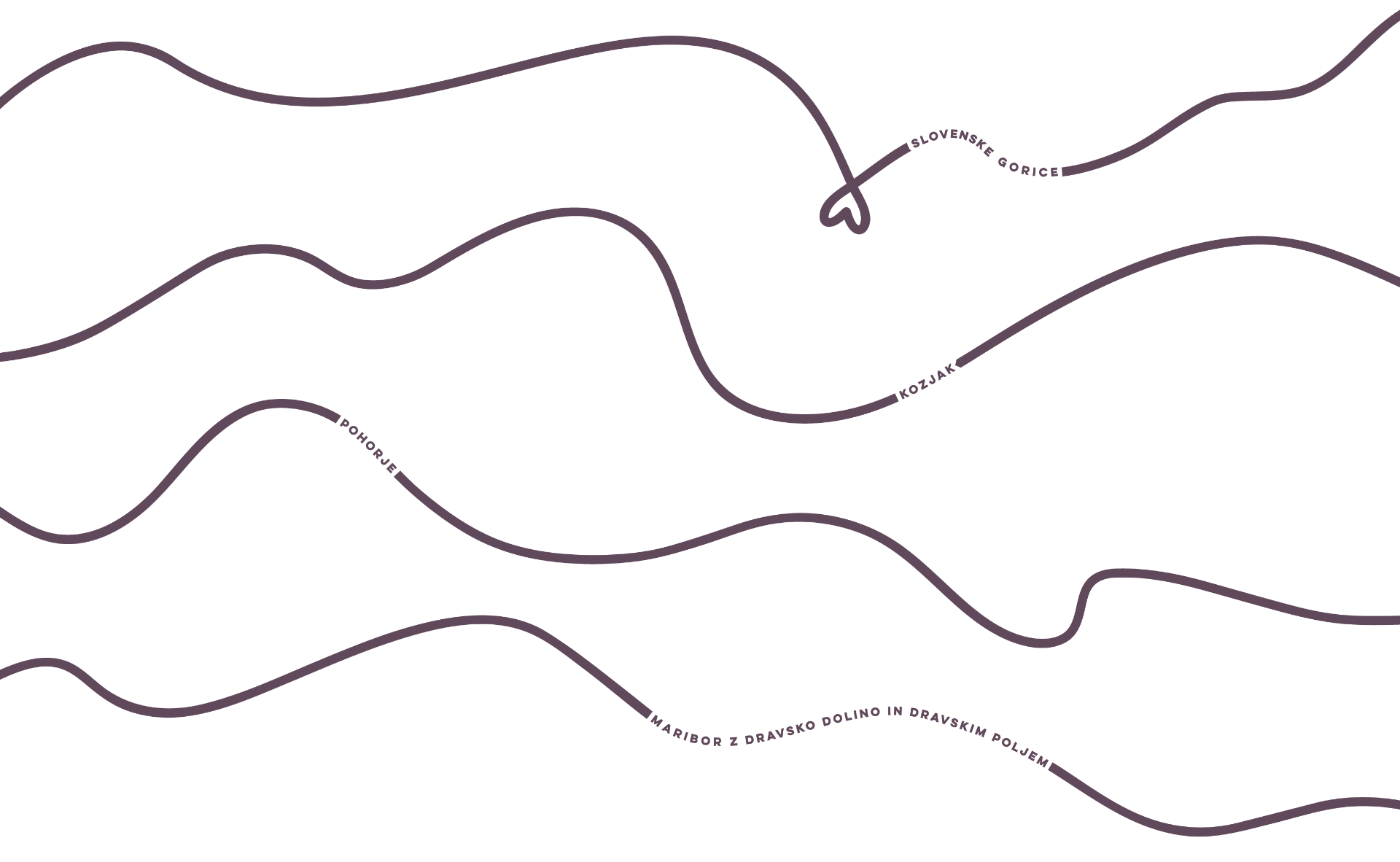
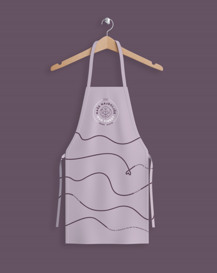
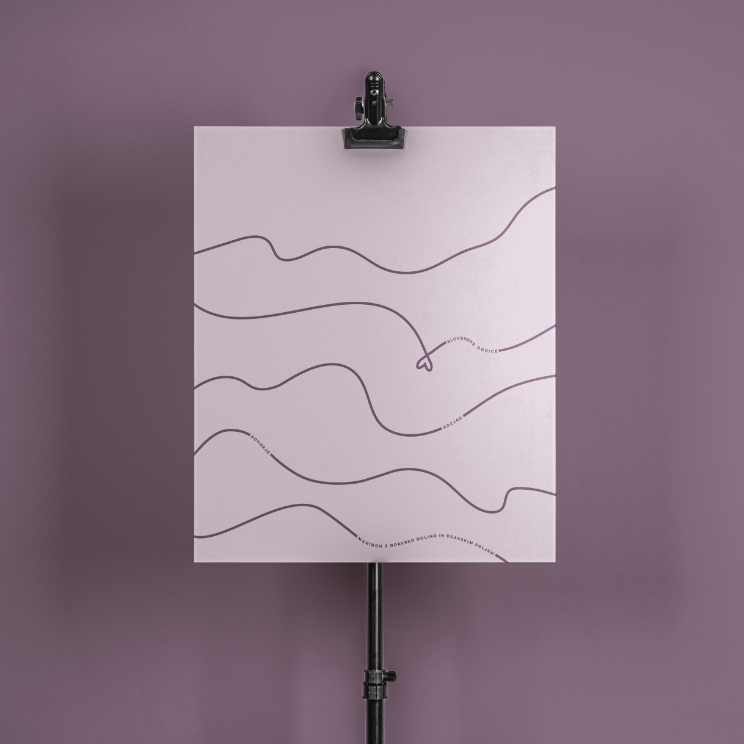
The graphic element rhythmically draws lines marking the four areas. Those areas together make up the region the brand represents.
With a goal to unite best local providers of services, products, accommodation and experiences, we designed a comprehensive graphic identity for the Maribor Tourist Board and established the basis for the new communication platform Our best.
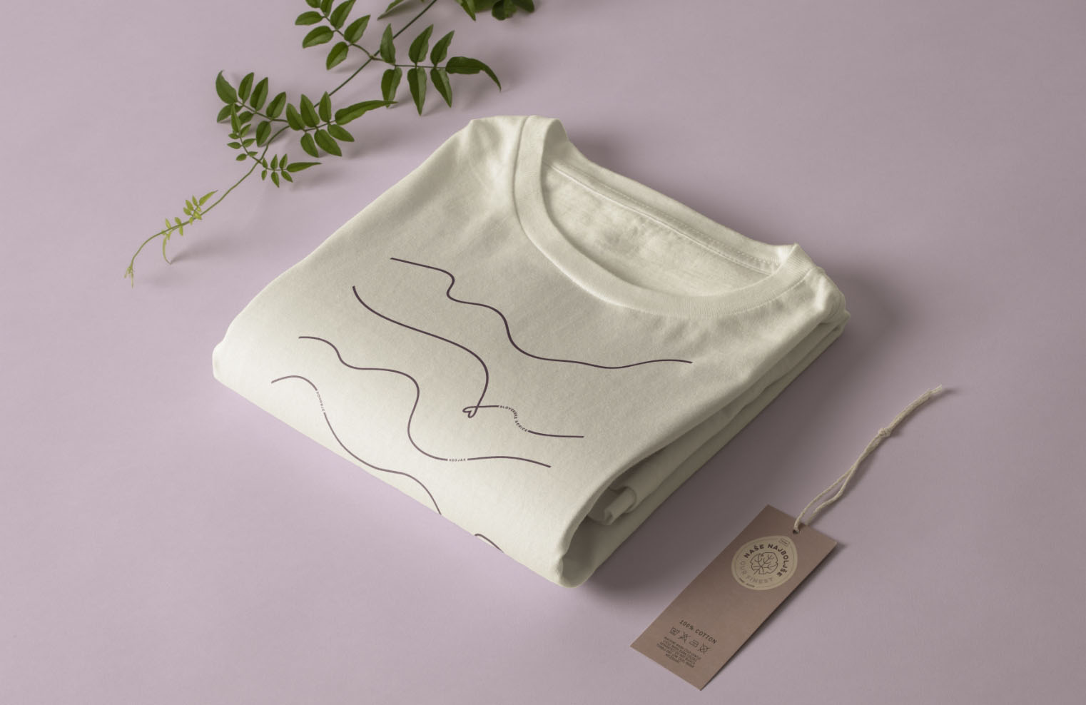
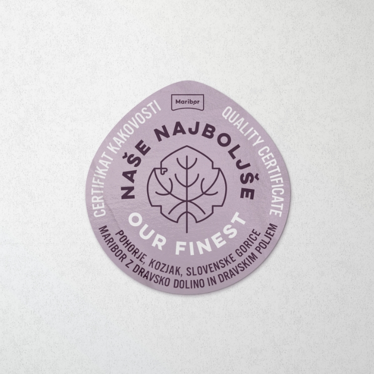
The logo hides a stylized image of the oldest vine leaf. The supporting graphic element elegantly depicts landscape of Maribor with the Drava Valley and Drava plain, the hills of Kozjak , Pohorje and the landscape of Slovenske gorice with the famous "wine heart".
In choosing the name, we proceeded from an authentic experience that expresses the values of personal, genuine, local and sustainable development. It exemplifies Styrian hospitality, which will from now on be dressed in uniform packaging and certificates of local products under the name Our Best.
The graphic element rhythmically draws lines marking the four areas. Those areas together make up the region the brand represents.


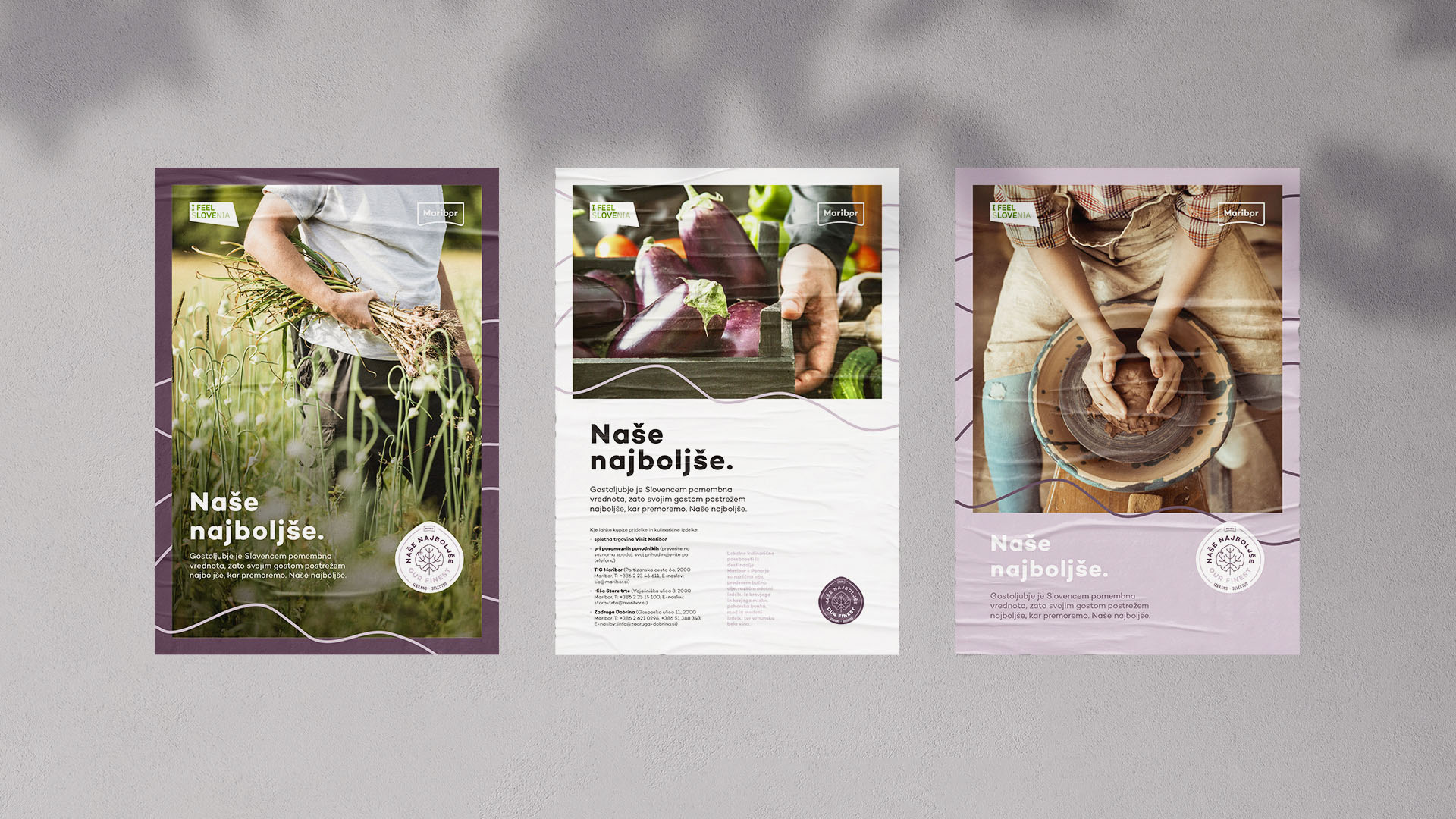
Hospitality is a very important value for Slovenes. That is why we offer our guests only the best we've got. Our best.
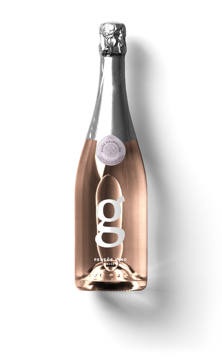
Unified appearance of product packaging offers consistent communication within the collective brand Our Best.

