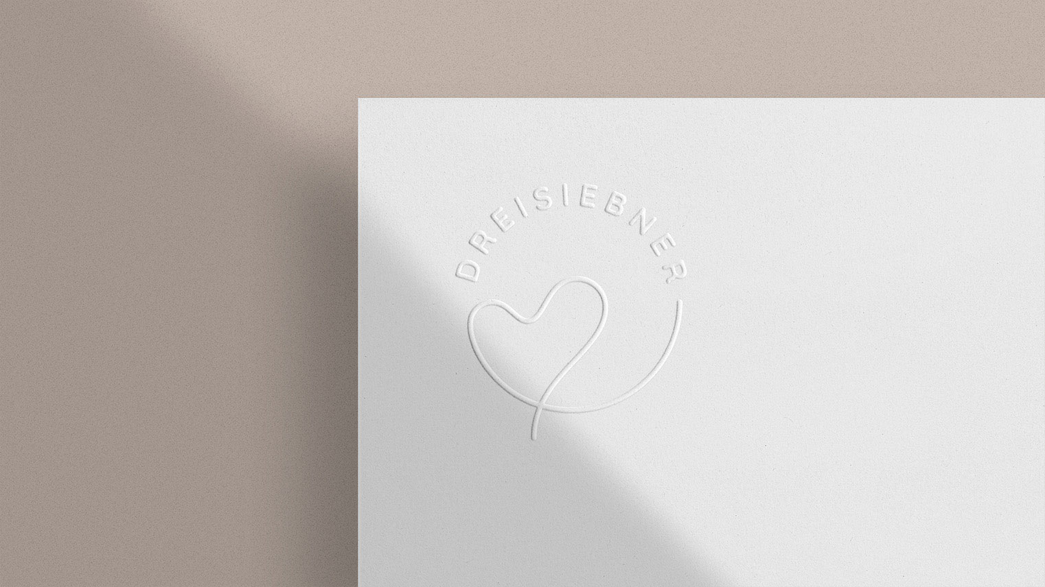
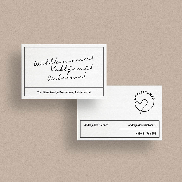
A modern sans serif font and one bold simple symbol. Circular strokes and soft finishes in symbols and typography. The basic figure on which the whole structure is based is a circle. The recognisable symbol of the "heart among the vineyards" is wine road. The logo is placed in a circle, which is a symbol of community, connection, friendship and love.
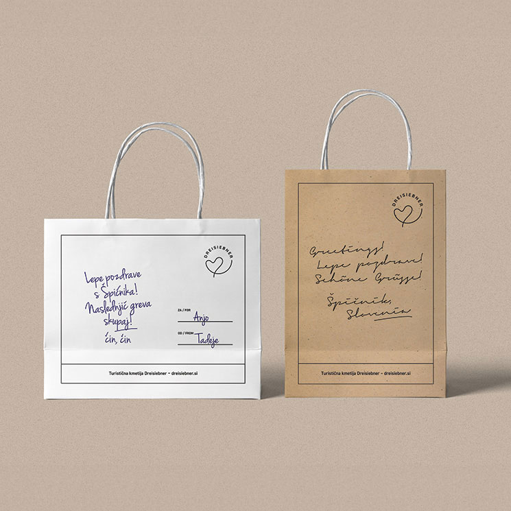
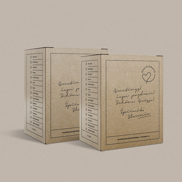
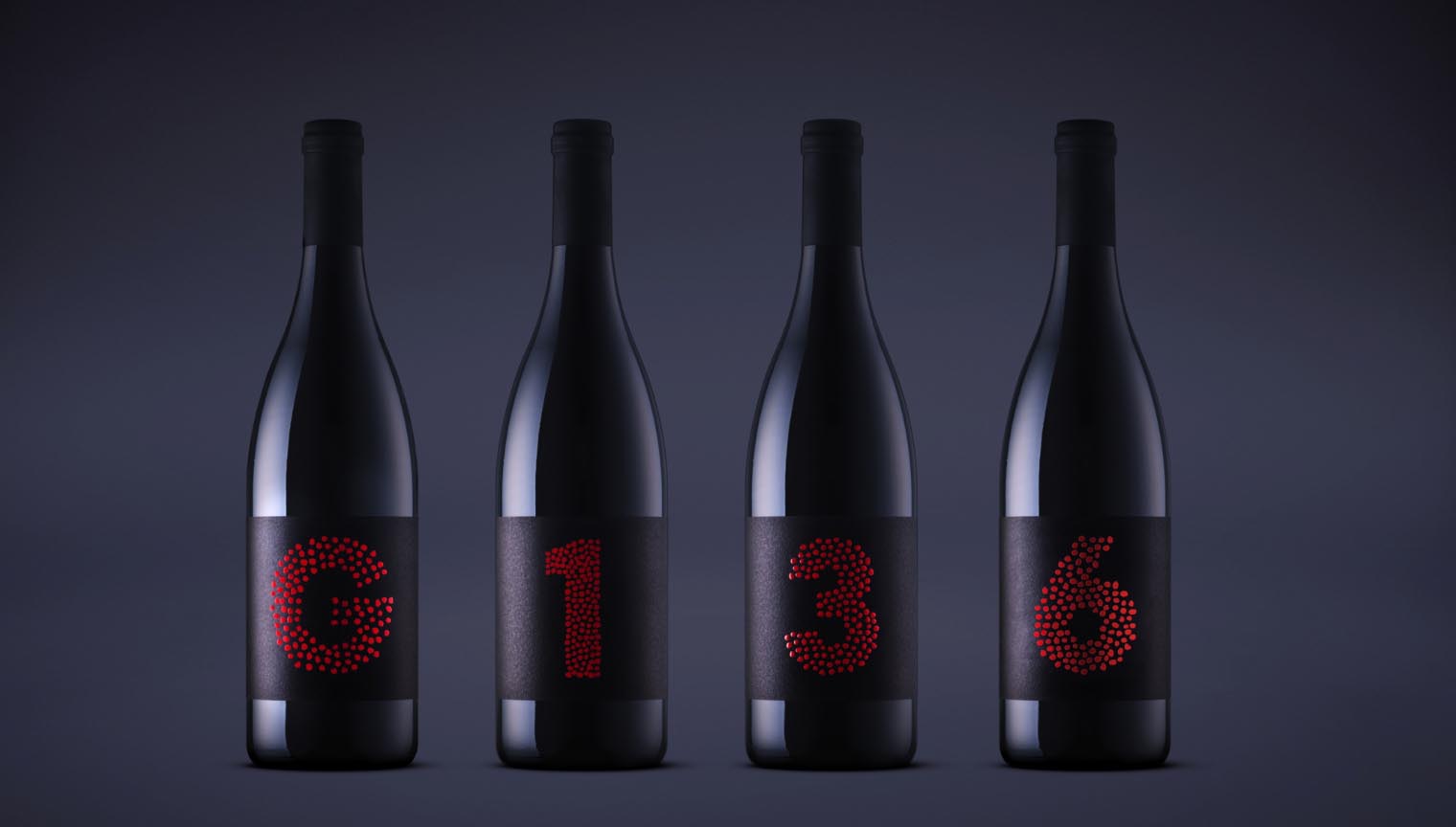
For the tourist farm Dreisiebner, we created a new brand identity, designed the wine label lines and crafted the communication platform. 🍷
The heart among vineyards is one of Slovenia's tourist pearls, which is visited by thousands of local and foreign guests every year. Many foreign tourism organizations use it in their campaigns.
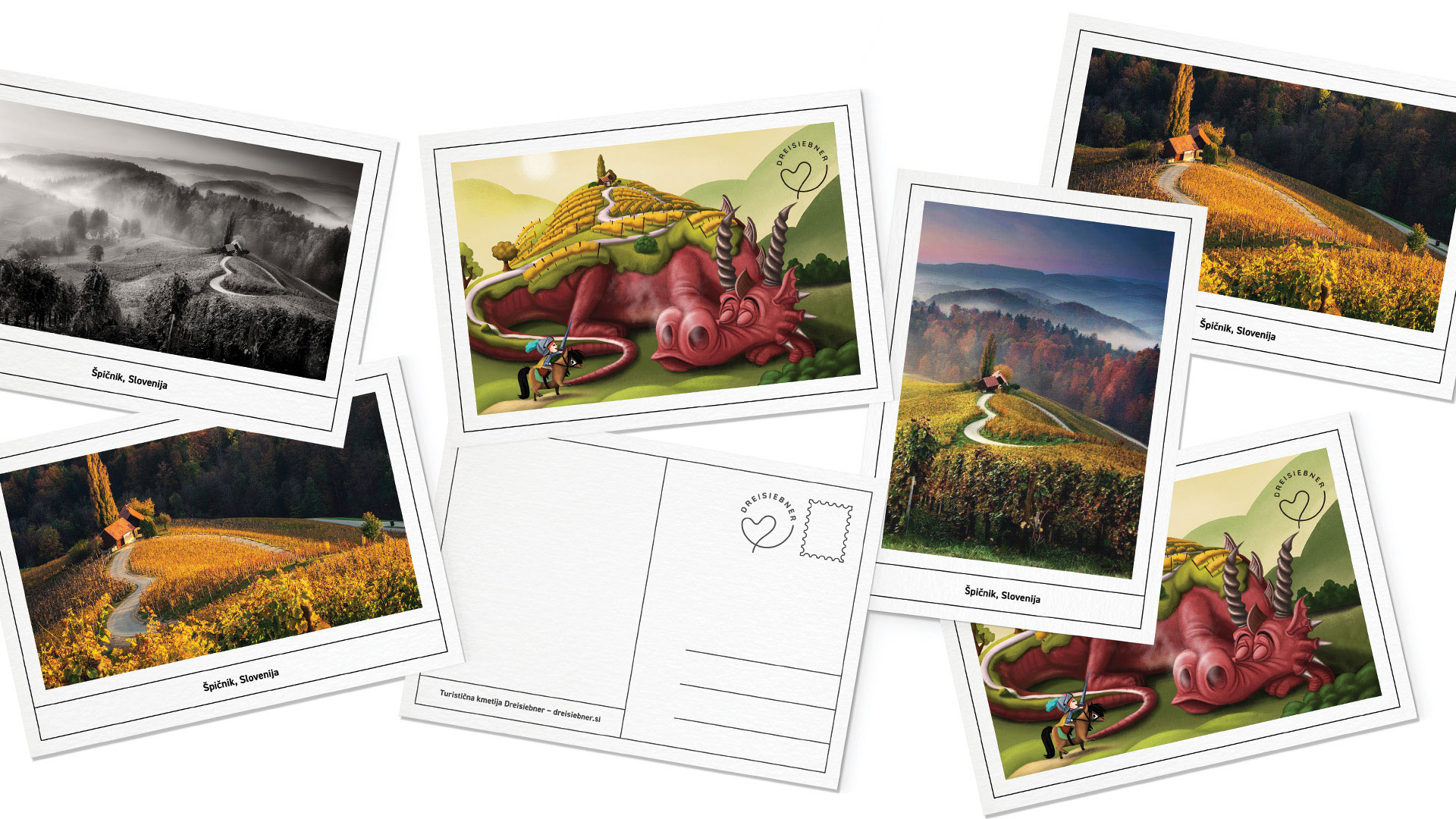
The view on the romantic road evokes thousands of impressions and feelings that visitors like to share. With this idea, we developed a visual identity based on the famous image of the road in the shape of a heart.
The heart road among the vineyards is a well-known Slovenian attraction that attracts all generations of people. We want to share its romantic nature, native vineyard environment and heartfelt thoughts when looking at it with others. This is how the basic idea of a holistic identity was developed, based on the sharing of impressions and feelings when looking at the road.