
For Superdoza, we developed the name, the positioning slogan Napolni se. / Recharge., the visual identity, and the complete brand communication system. The identity is built around the idea of the products as a source of energy for everyday challenges. That is why the packaging is designed as a battery pictogram, clearly organising the key information: product name, purpose, functionalities, and main benefits. From this core principle, we developed a recognisable visual system that extends across all brand touchpoints – from packaging and sales materials to digital formats, communication, and campaigns.
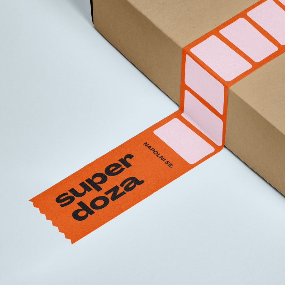
We designed the packaging as a battery pictogram, which became the foundation for Superdoza’s complete visual system.