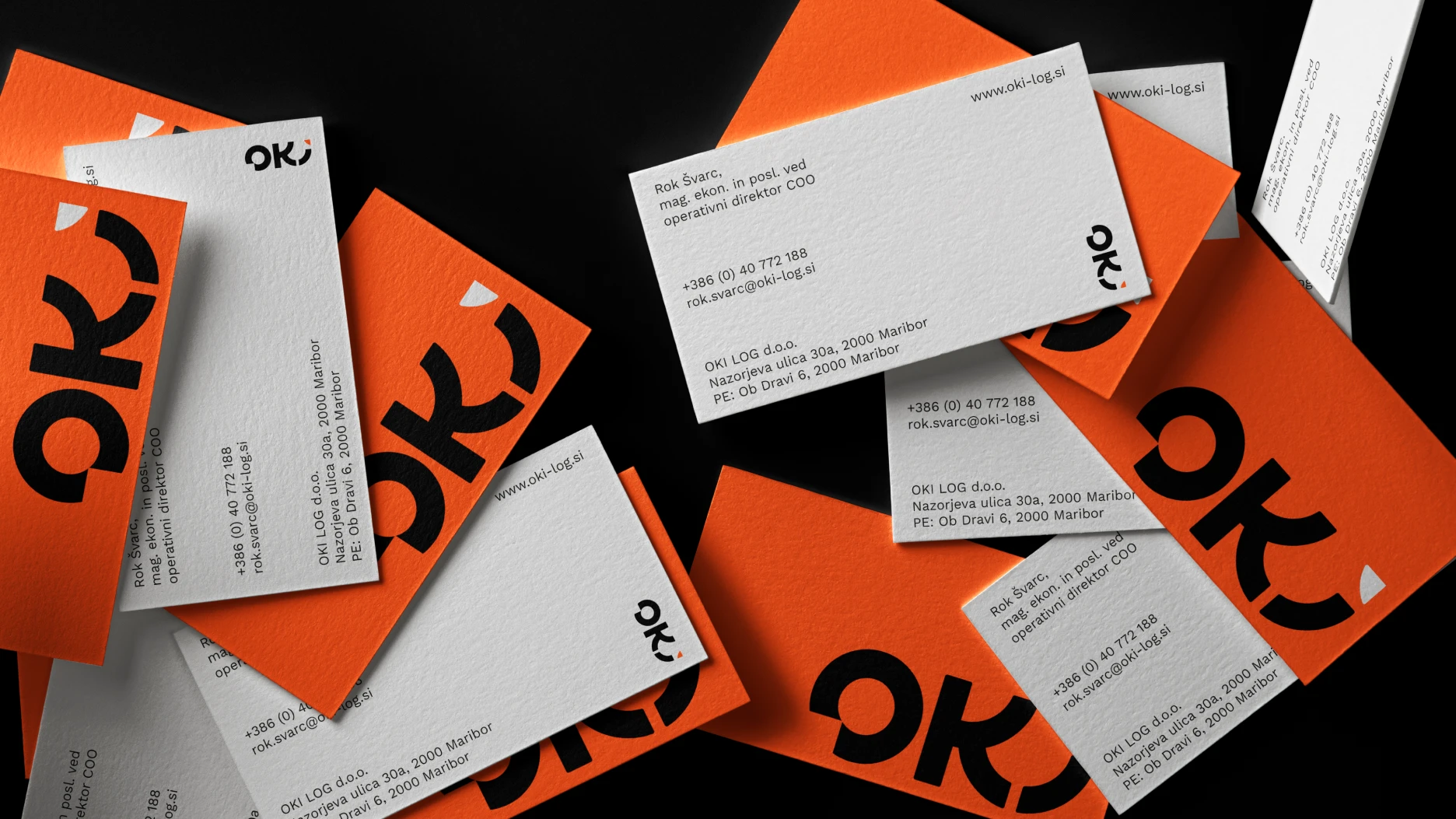
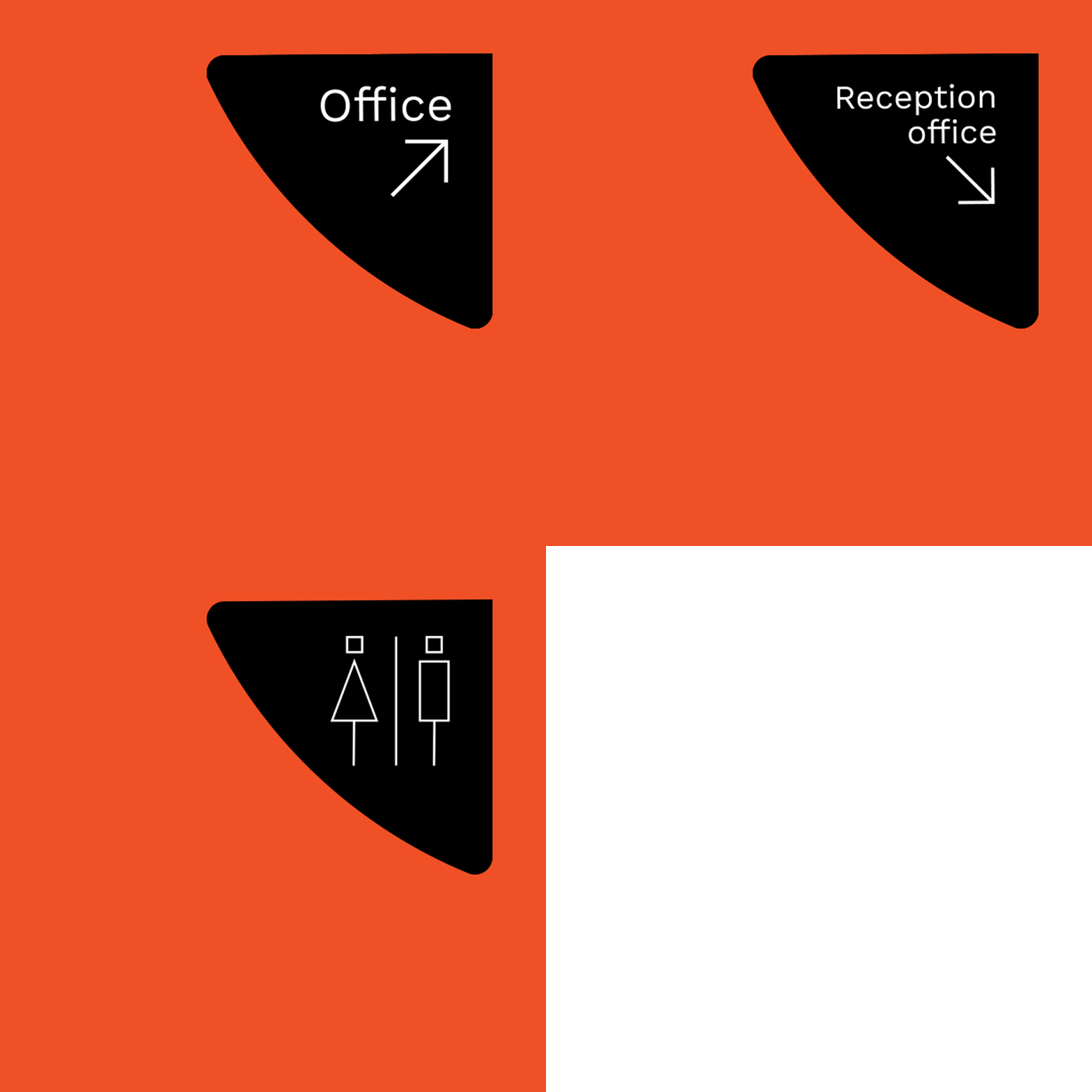
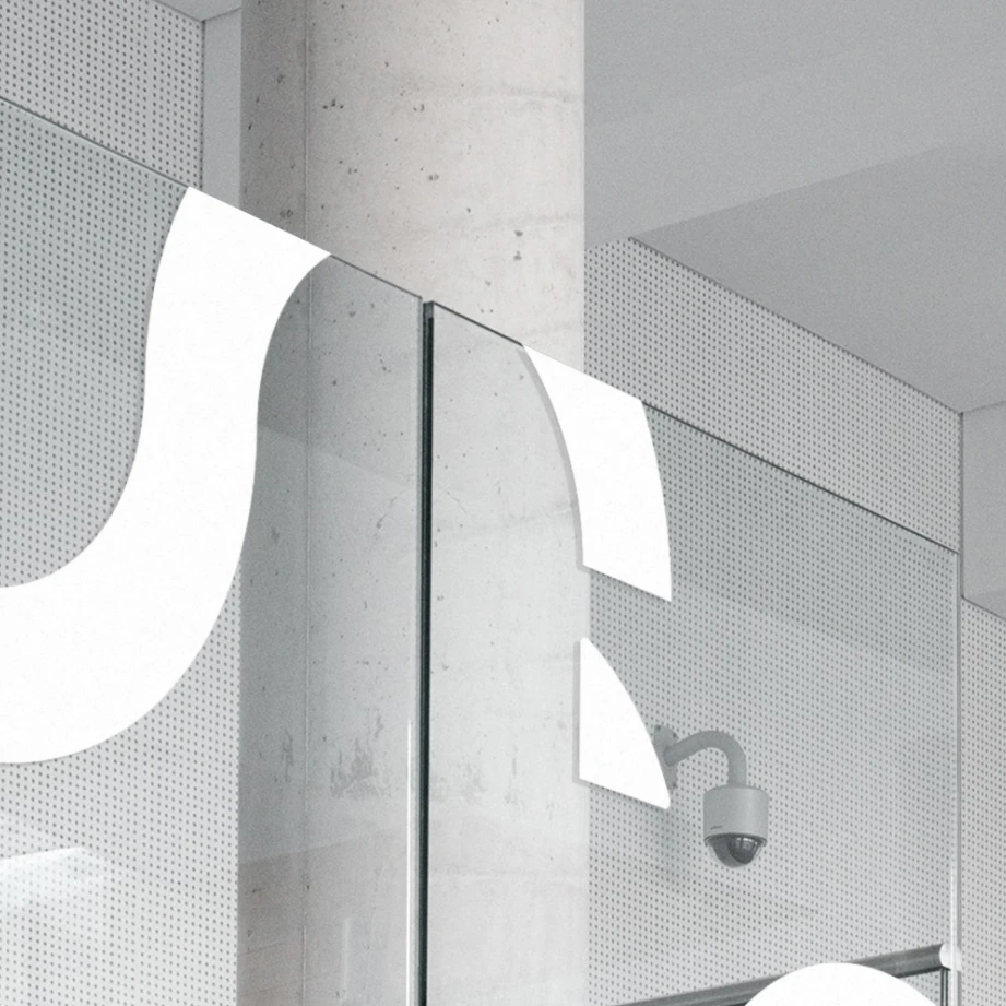
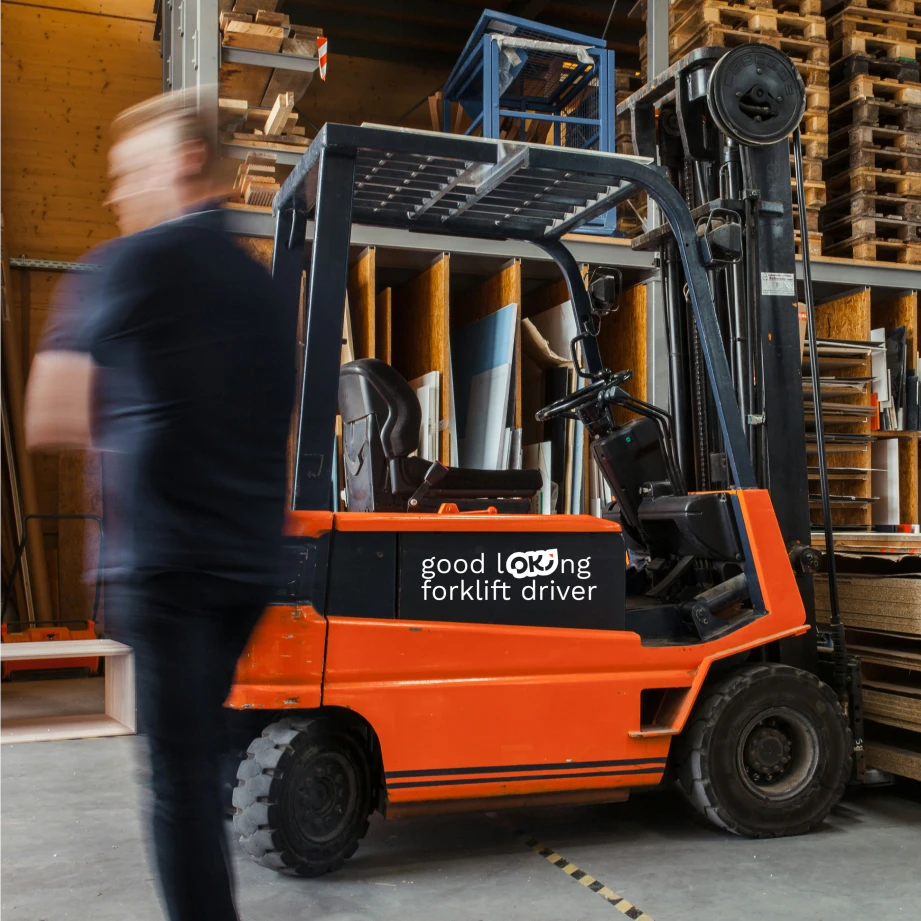
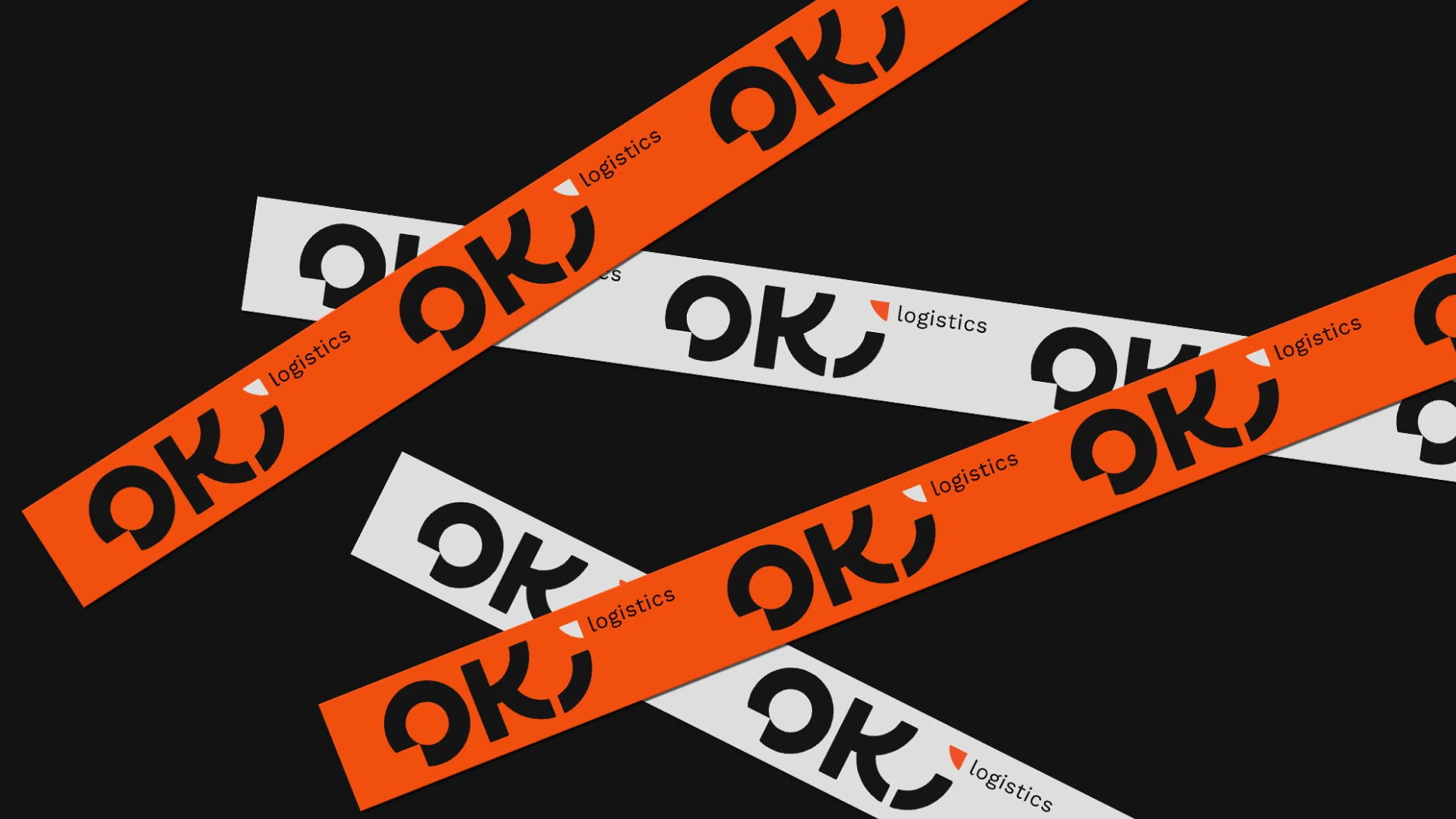
For the logistics company OKI, we developed a contemporary brand identity system that clearly communicates the brand's key strengths: a customer-centric approach, a reliable role in logistics processes, and a positive working environment.
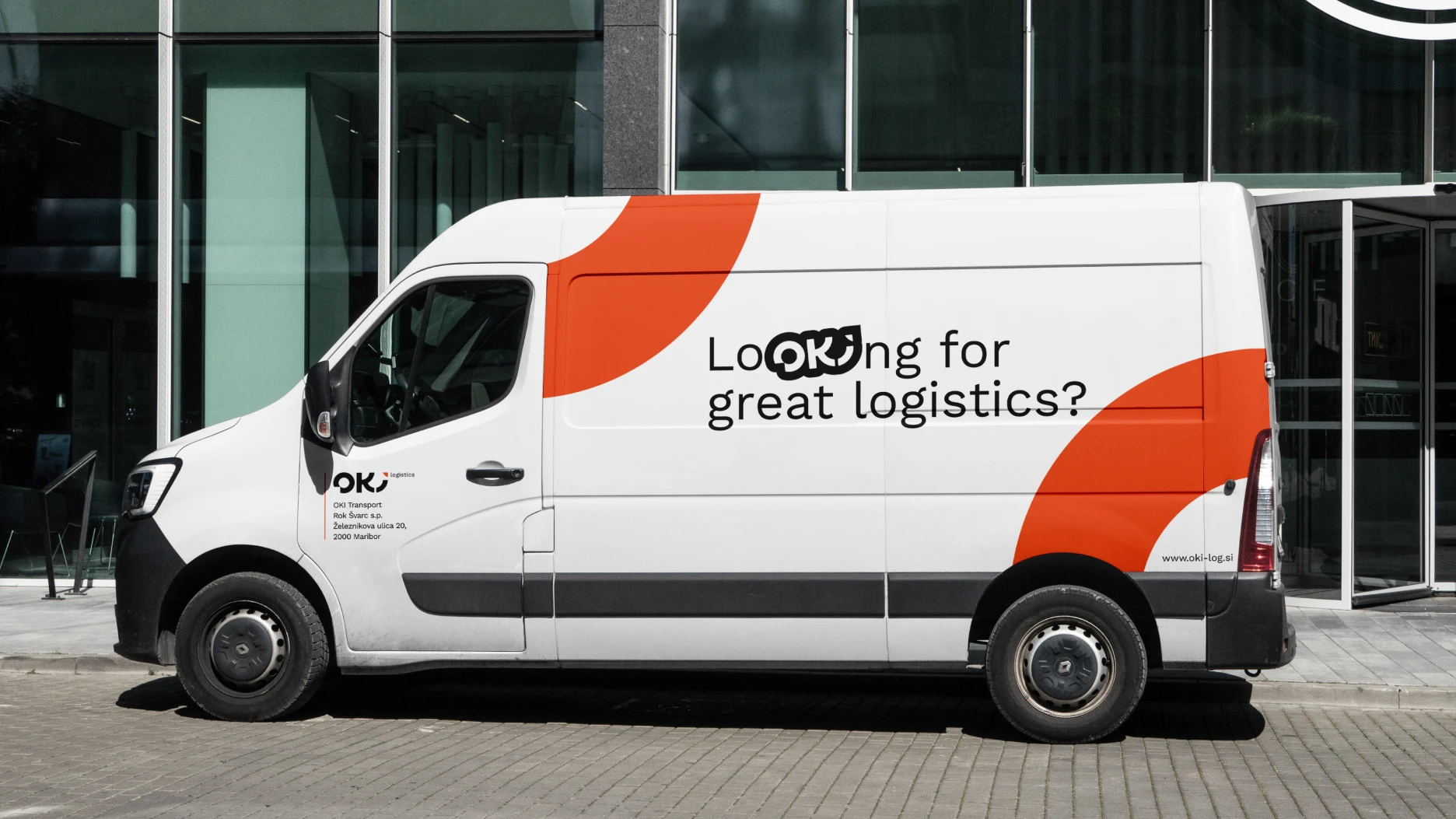
The logo is based on the combination of simple geometric shapes, forming a distinctive visual language. Its rounded forms convey flow, connectivity, and continuous movement—core elements of modern logistics. Beyond serving as a standalone mark, the logo becomes an active communication element that integrates seamlessly and playfully into the company's various brand messages.
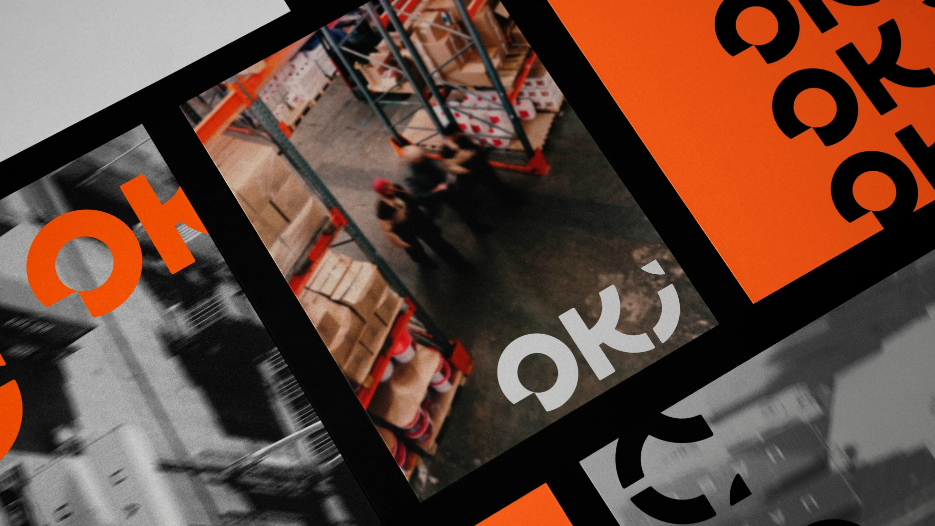
The logo goes beyond its role as a visual mark, becoming an active communication device that integrates naturally and playfully into the company's various brand messages.