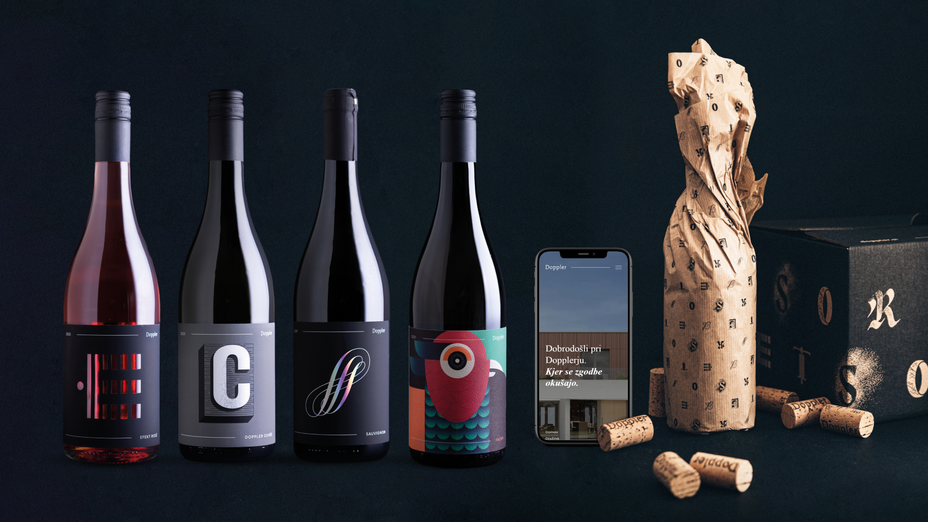
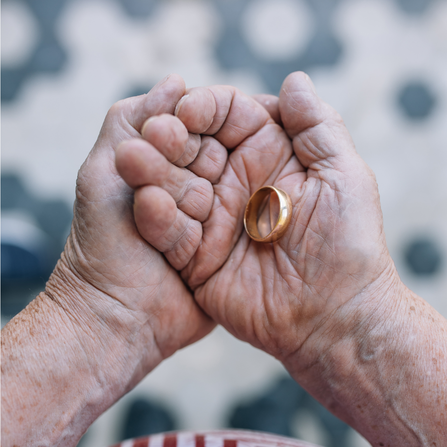
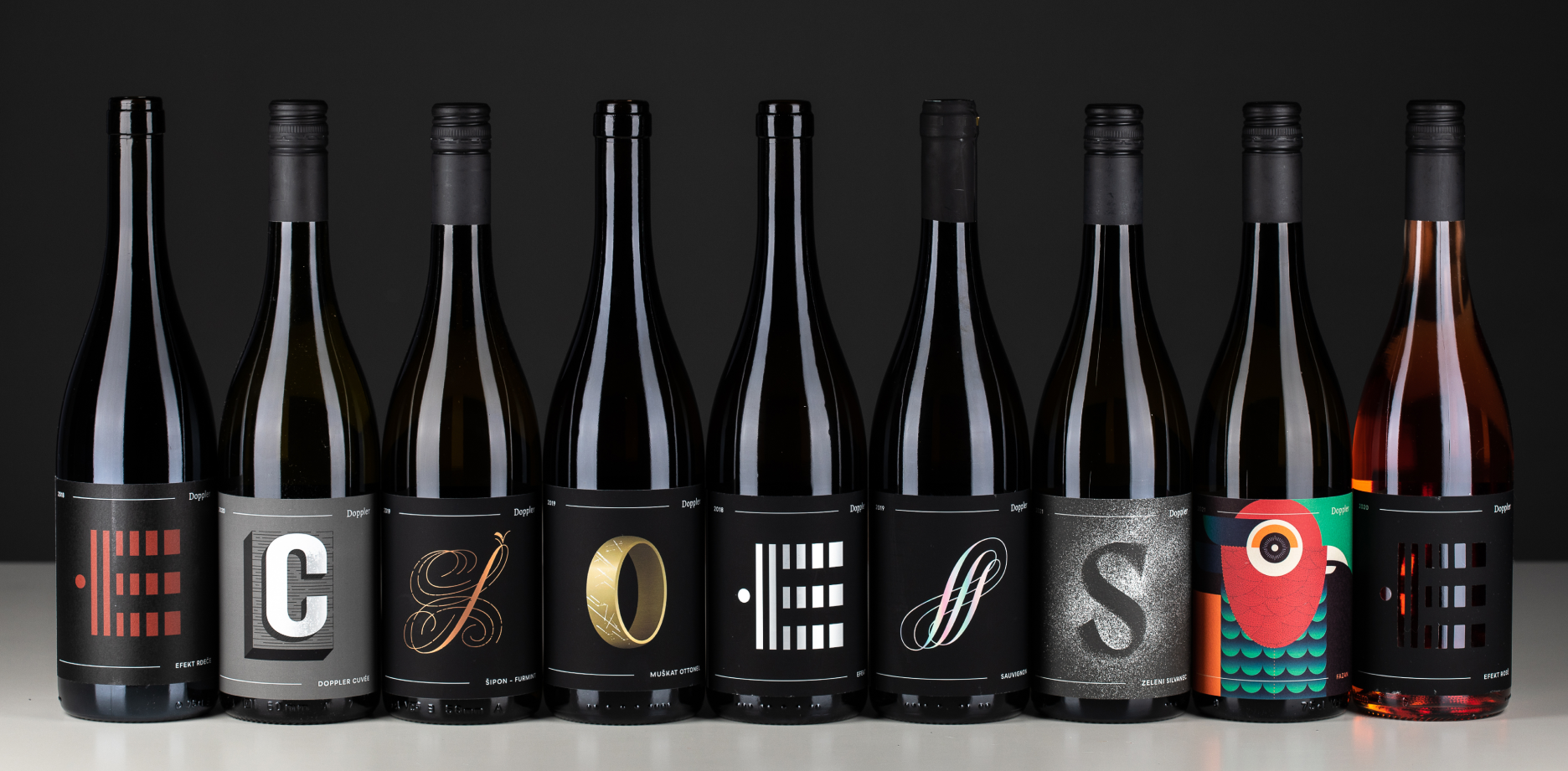
For Hiša vin Doppler, we built on the brand’s overarching story to develop a complete identity redesign – from the logo and wine labels to the website, shop, promotional materials, and other communication assets.The stories of three generations of winemakers were distilled into a recognisable visual communication system, where each letter is both the initial of a grape variety and a visual manifestation of the story on the back label. The labels therefore become more than wine markers – they carry the identity, heritage, and character of the brand. In this way, the authentic stories of Hiša vin Doppler travel through wine and sparkling wine labels, with each bottle becoming part of a larger family narrative.
The new logo combines two typographic characters: serif and sans serif. The serif typeface, with its historical weight, represents tradition, while the sans serif brings modernity, freshness, and the sense of a new chapter to the brand.


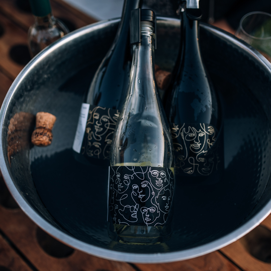
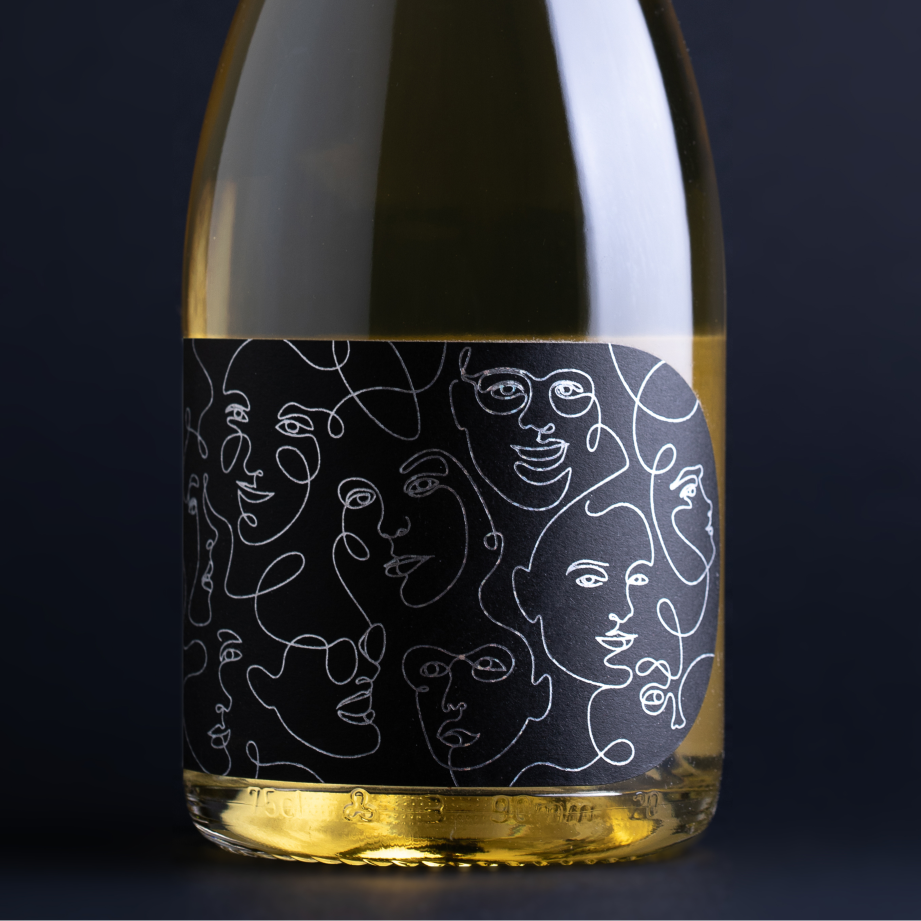
The story of Pét-nat is about magic and about a crazy squirrel. Her mischievous character is captured in a lively and playful illustration. The entire series of sparkling wine labels appears in six different variations, where parts of the illustration are mixed. You can put the crazy squirrel back together online in The Pet Nut Game.
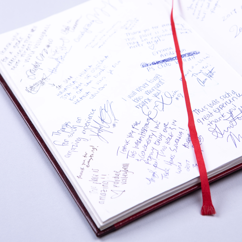
We transferred the authentic notes from the Doppler book of impressions onto a series of wine labels for the house wine collection. With this, we found a place for the most heartfelt notes, which represent the essence of the Doppler brand to wine lovers.